
#005
Logo Development · Brand Identity
2026
Epic Wave
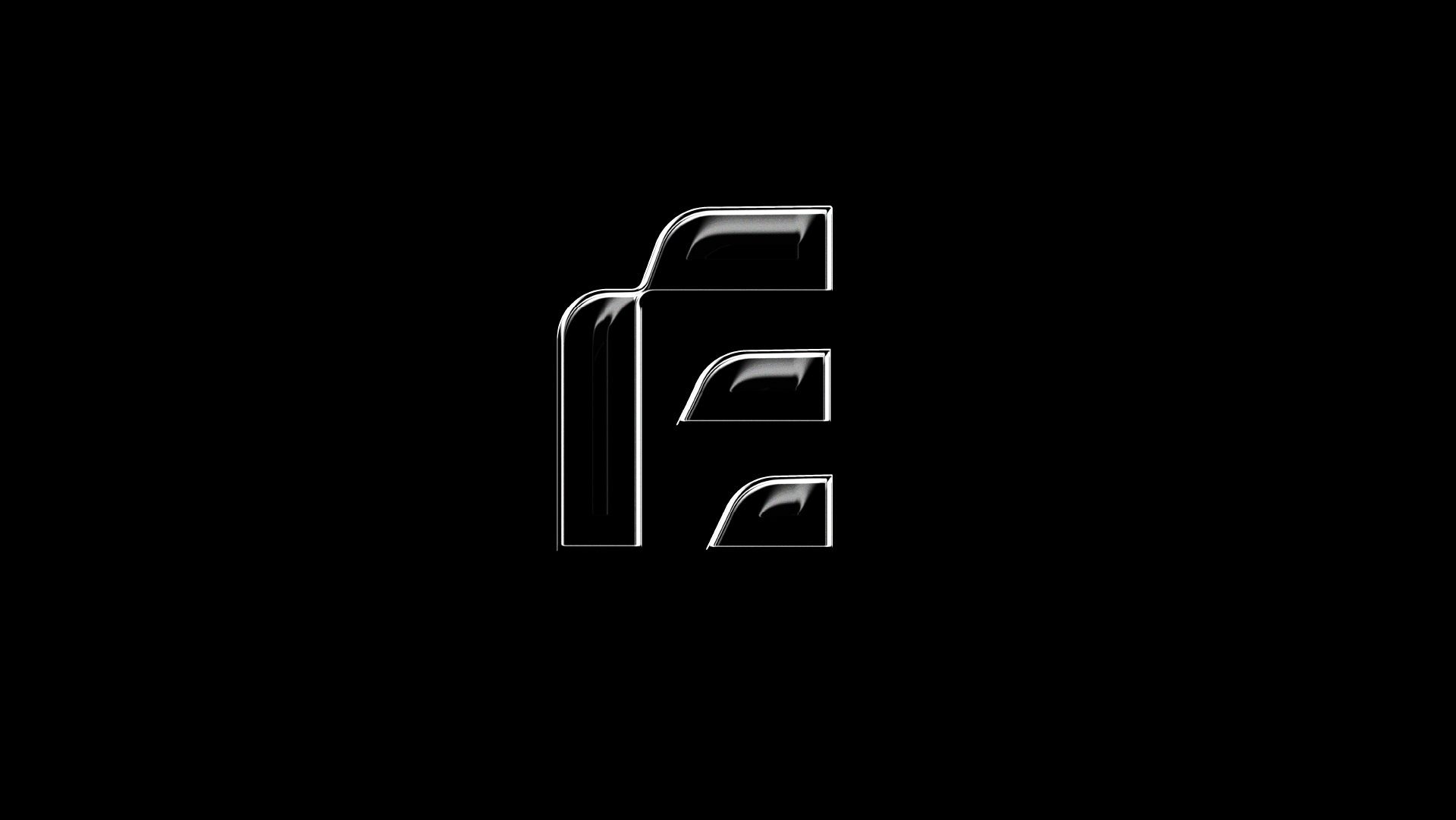
Many solutions. One wave.
The idea
Epic Wave builds across multiple tech disciplines, so the mark couldn't belong to just one. We started with the E and let it move.
What we did.
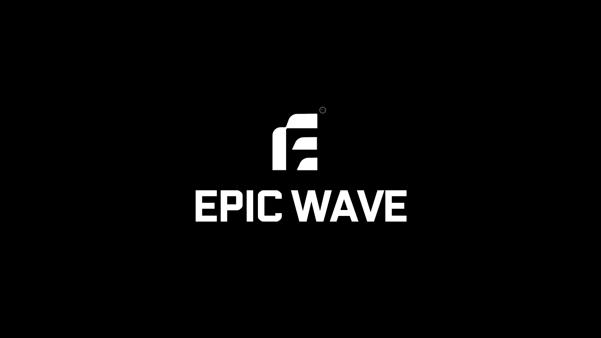
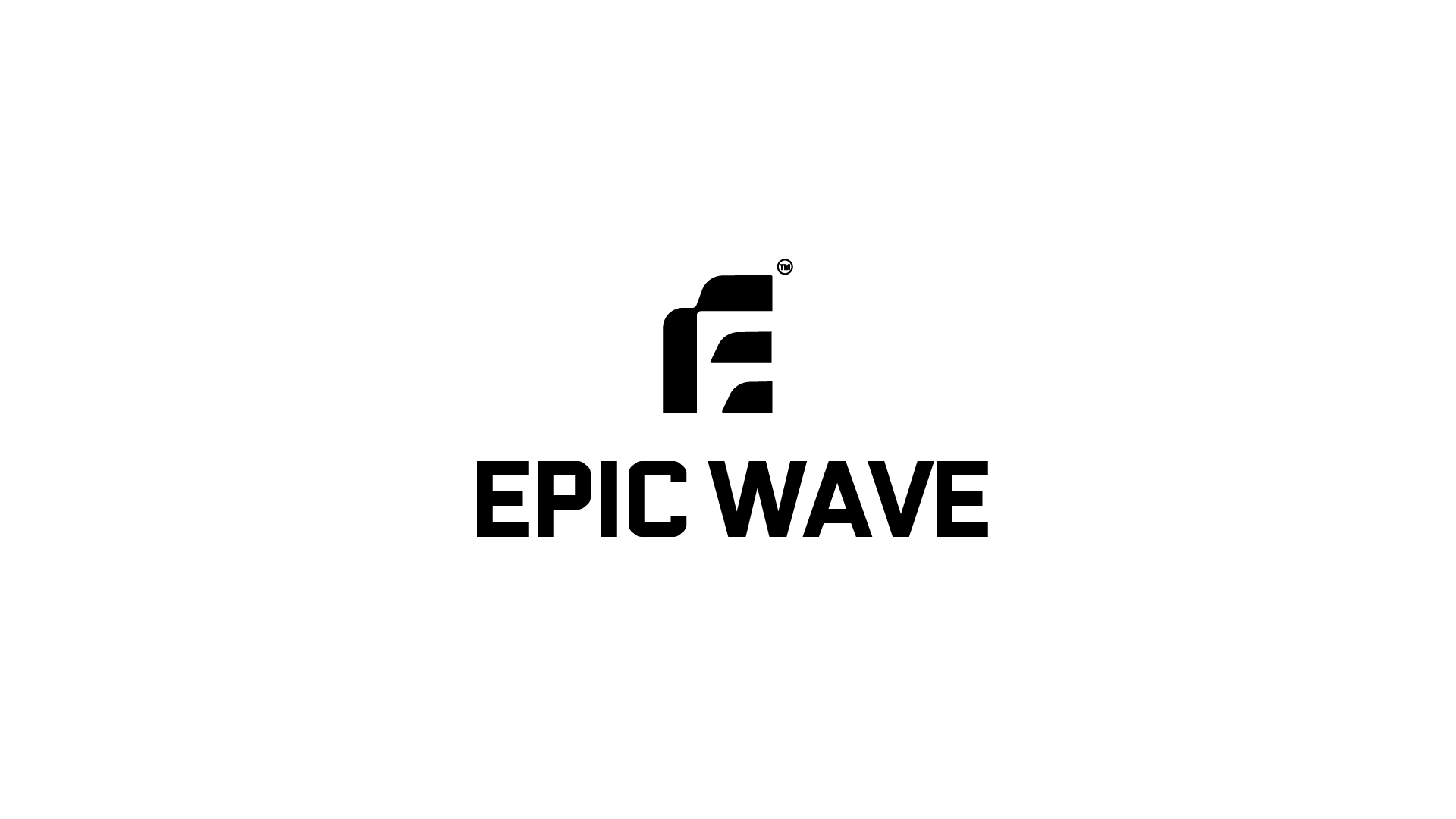
The mark. An E built from three stacked, forward-leaning strokes. Read it as a letter, a signal or a wave breaking. Each stroke is a solution, all moving the same way.
The wordmark. Heavy, squared-off type with soft cut corners. Engineered, not cold.
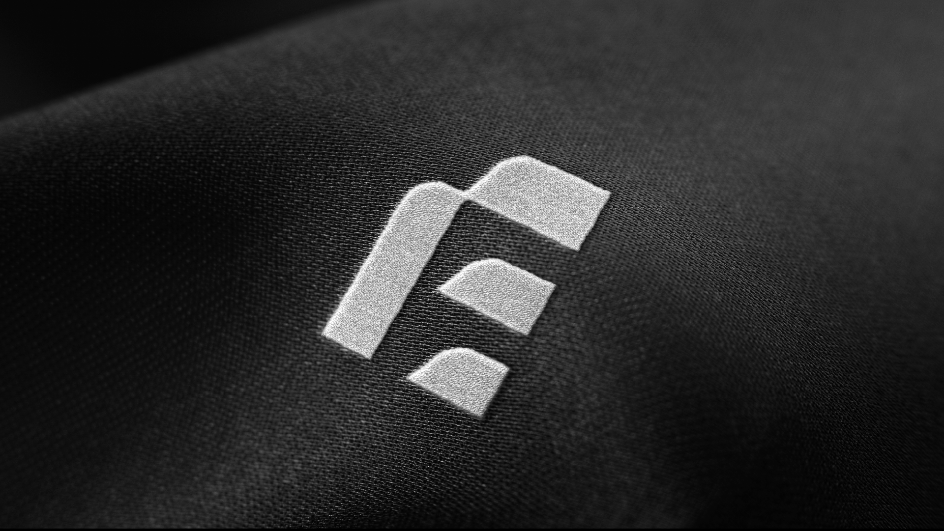
The system. Black, white and nothing extra. It holds up stitched on fabric, rendered in chrome or shrunk to an app icon.

Watch it.
More drops.
All work →


Got one
like this?
Bring the idea, the problem or the chaos. We’ll tell you honestly if it’s for us.